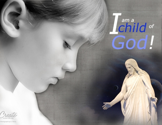
- Description: A spiritual montage project.
- Process (Programs, Tools, Skills, Steps taken while designing): For this project I used Photoshop to blend two pictures together and to make them look like one flowing image. I had to find the two images I used by going on google. I then started to play with the sizes of the two images and created the design. Then I added in the text to the project. The next step was adding in the texture filter.
- Message: We are all children of God.
- Audience: Everyone with a focus on LDS families.
- Top Thing Learned: It is way easier to blend similar backgrounds and your choice of images in important with something like this.
- Filter / Colorization used and where it was applied: Concrete texture applied on the background image of the child.
- Color scheme and color names: Monochromatic Blue
- Title Font Name & Category: No title
- Copy Font Name & Category: MS Reference Sans Serif Regular, Sans Serif
- Thumbnails of Images used:


- Sources (Links to images on original websites / with title of site): http://mormonwoman.org/2011/02/24/get-to-know-him-a-poem-about-coming-to-know-christ/ https://www.google.com/search?q=lds+youth&espv=2&biw=1920&bih=979&source=lnms&tbm=isch&sa=X&ved=0ahUKEwj3-oy77fjMAhVB82MKHQbiB8AQ_AUIBigB&dpr=1#q=lds+children&tbm=isch&tbs=isz:lt,islt:4mp&imgrc=aVVYmdK0sgNQeM%3A

Beautiful message and design. The way you masked the two pictures made it look very natural. Your color scheme was beautifully simple as well. The images you chose and the text formatting and colors really made the message stand out: “I am a child of God!”
LikeLike
Check out my site: https://commbek.wordpress.com/design/
Check out this other site too: https://makennamaallan.wordpress.com/2016/05/28/project-4-montage/
LikeLike
I really like the simplicity of this design. The contrast with your text looks great. I like how you tied in the texture to the background of the image. Without it, it would have been too dark. It looks very well put together and clean. Nice job.
LikeLike
Forgot again… https://davidgrasse.wordpress.com/2016/05/29/project-4-montage/comment-page-1/#comment-11
LikeLike
Hey Shawn, your project looks great! I really like the color scheme you chose and how it was consistent throughout your design. I also liked the gradual transition between your photos. The texture in the background looked great with your design as well. I think your message was very clear and worked well overall.
I also really liked this montage, which used the same color scheme in a different way https://tannerwaitedesign.wordpress.com/2016/05/28/project-4-montage/
LikeLike